Entry tags:
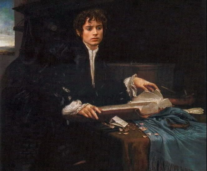
Frodo Art Travesty: Frodo in his Study....

~ detail from "Frodo in His Study"
My "new" Frodo manip is actually a re-do, but a re-do from the ground up....
Recently, looking for a different work, I found a much better copy of the painting I used for my first version of this manip, Portrait of a Young Gentleman Reading (or, "Portrait of a Gentleman in his Study"), by Lorenzo Lotto. Goaded by its clarity, I made my own screencap of the image from FotR (Amon Hen) I had found on an internet gallery and used for the face last year, and re-did the manip.
I credit this to a fan of the manips who liked the first version of this particular Frodo Art Travesty so well, I wondered if I could improve upon it. The version I first did, which she saw, never fully pleased me because it was so small and murky, although it had its own charm. (It can be seen here.) I did not take it down from the Photobucket gallery, however, because it really does look like a different manip. The copy of the painting I made it from is so different (in colour values and in resolution), it makes the finished manip different, and I sort of like them both.
Below is the part of Tolkien's text that inspired me to make this manip in the first place, from the last chapter of The Return of the King, "The Grey Havens"....
One evening Sam came into the study and found his master looking very strange. He was very pale and his eyes seemed to see things far away.
‘What’s the matter, Mr. Frodo?’ said Sam.
‘I am wounded,’ he answered, ‘wounded; it will never really heal.’
But then he got up, and the turn seemed to pass, and he was quite himself the next day. It was not until afterwards that Sam recalled that the date was October the sixth. Two years before on that day it was dark in the dell under Weathertop.

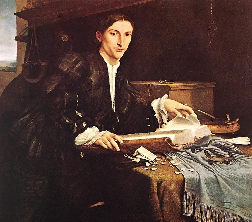
~ "Portait of a Gentleman in His Study," by Lorenzo Lotto, c. 1527:
~ Mechtild
Frodo Art Travesties Table of LJ Entries page HERE.
Frodo Art Travesties Album HERE.
no subject
I followed your advice to start: I cut off the head again, extended the neck and added more shadow. But the main thing I did was notice that I had inadvertently slightly widened Frodo's cut-out face image when I was colour-correcting it the first time, which made his face ever so slightly distorted - flattened from top to bottom.
I am wondering if that isn't what you saw, in actuality, because I think it made a subtle but strong difference, once I replaced it with a cut-out that was correct -- even without any neck adjustments. I had been thinking the screencap slightly "froggy-looking," though I couldn't think why, looking from a window with the cap open to the finished manip.
See what you think. (The "new" model is in place above.)
no subject
no subject
no subject
I did not see your manip last night, but I opened it just now. You sent it to my old email address which I never use anymore because of its unreliability when I am returning messages.
My more recent email address is mechtild1@gmail.com. You sent it to the chartermi.net address.
Again, thanks so much!!!!
no subject
*huge smooches*!!!!!!!!
~ Mechtild
no subject
I feel a WHOLE lot more comfortable betaing art, something I actually know, than writing. I always feel self-conscious suggesting something having to do with stories because, quite frankly, I was a product of US schools and while I am more literate than most of my fellows, I have no illusions that I am a master of my own language. Drawing, on the other hand, I am better than most (though not all) at and feel confident that, even if you don't take a suggestion, I am not steering you wrong. ;)
no subject
no subject
Frodo in Italian Renaissance's attire (dark and sliced) never fails to send me in altered states of ecstasy.
no subject
no subject
no subject
Heavens, you are throwing huge confetti!
Thanks for the welcome :-)!